Designers Agree: This Earthy Shade Is Their Favorite Paint Color of All Time
Less is often more when it comes to paint options. If you've ever brought home too many swatches and gotten seriously confused, we understand.
We love keeping up with which paint colors are currently trending, so we put out a call to several designers to find out which ones they've been loving the most lately.
Interestingly enough, one hue in particular stood out as a common choice, and we're thinking it could be a new neutral.
Winner: Shades of Muted Greens
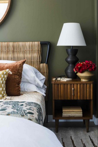
Design by Dan Mazzarini / Photo by Adam Kane Macchia
Green was the one color that all the designers we surveyed listed, and each version leaned much more muted than the jewel-toned greens we recently saw taking center stage.
Want more design inspiration? Sign up for our free daily newsletter for the latest decor ideas, designer tips, and more!
Treron Green No. 292 by Farrow & Ball
Shailey Murphy is an interior designer based in southwest Missouri, and her designs often show off multiple colors with similar undertones that harmonize well together.
Lately, Treron Green has been one of her go-to colors.
"This is a true medium green," Murphy says. "It isn't too light or too dark, and it's for sure not a hunter green. It reads as a perfect neutral pop of color that can work in almost any space."
Mediterranean Olive by Benjamin Moore
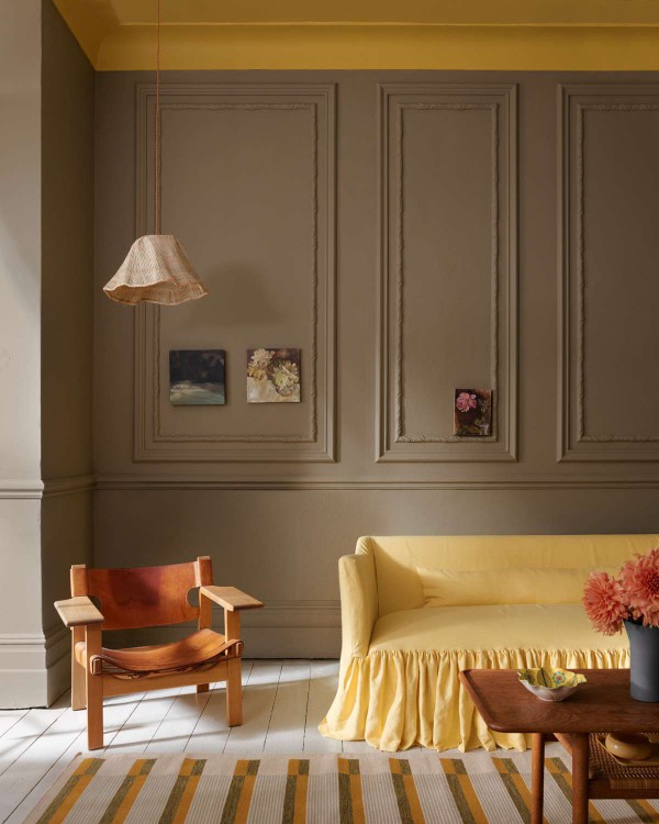
This dark version of olive shows off golden undertones, so it's perfect for spaces where you want to add a little warmth. Dan Mazzarini is the creative director and principal of BHDM and ARCHIVE, and he often reaches for Mediterranean Olive for walls and millwork alike.
"The color is bold and not for the timid," he notes. "But I've found that the deep, earthy tone makes rooms cozy and organic. It's also a great backdrop for art."
Lucienne Olive by Craig & Rose
Craig & Rose
This olive-meets-sage hue almost reads as brown in certain situations. Flora Hogg is the in-house interior designer and color consultant at Craig & Rose, and she describes Lucienne Olive as "a subdued peat green."
This paint is part of the company's 1829 Vintage Collection, so it's especially ideal for historic spaces and old-world designs.
"Its earthiness provides the perfect bases to pull luxe elements like brass hardware, ochre mohair curtains, and teak wood," Hogg says.
Tea Light by Benjamin Moore
Purvi Padia, interior designer and founder of REVELRY, cited a more faded earth-toned green as one of her current favorites. Tea Light by Benjamin Moore is a muted sage that invites tranquility into a room.
"It’s perfect for spaces where you want to evoke a sense of peace, like a bedroom or a home library," she says. "I’m drawn to its ability to act as a neutral and pair well with so many different tones."
Arsenic No. 214 by Farrow & Ball
Colordrunk Designs
This green stood out a bit from the other answers on this list. Arsenic No. 214 by Farrow & Ball is a mint green with a lively flair. But in true Farrow & Ball fashion, it is ever-so-slightly muted, which gives it a bit of a patinated look.
Jenna Gross of Colordrunk Designs cited this paint as one of her most recent color obsessions, and she loves pairing it with chartreuse, specifically Frolic by Sherwin Williams.
Runner Up: Orange
There was another color that commonly came up in our interviews, and it was a bit of an unexpected one. Three out of the five designers we talked to listed some version of orange as one color they can't seem to get enough of lately.
Red Earth No. 64 by Farrow & Ball
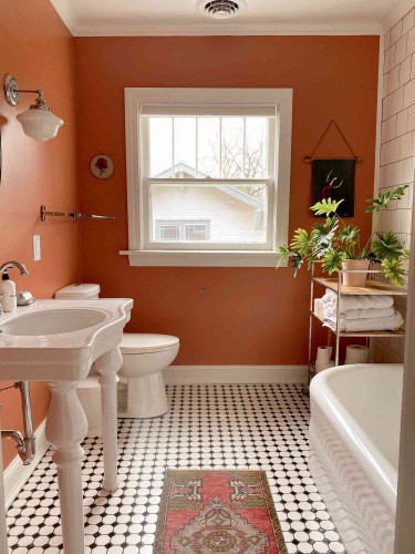
Shailey Murphy
This is a hue Murphy chose to use in her personal bathroom, and she recently also applied it in a client's primary bedroom on both the walls and ceiling.
"If you want to take some creative risks, this is my favorite statement color at the moment," Murphy says. "With a little bit of terracotta and a little bit of red, this color always makes for a dreamy high-impact statement."
Faded Terracotta No. CC8 by Farrow & Ball
Padia describes Farrow & Ball's faded terracotta as a color that adds "an instant dose of warmth and heritage." She especially loves applying it in neutral rooms that are heavy on both texture and mixed wood tones.
Troubadour by Craig & Rose
Troubadour by Craig & Rose is a cross between a flaming red and a rich orange. Hogg adores this color for its playful nature and vibrant energy.
"Troubadour embodies main character energy," she says. "Its dynamic presence becomes more than a design choice—it becomes a lifestyle statement."
RECOMMENDED NEWS
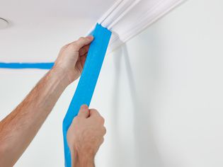
When and How to Remove Painter's Tape
Painter's tape is used to prep a surface before painting to mask off edges, ensure sharp lines, or ...
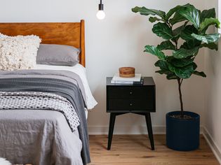
27 Midcentury Modern Bedroom Decorating Ideas
Midcentury modern bedrooms offer a calm and timeless design that blends seamlessly into any home. T...
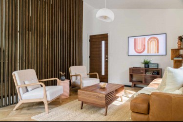
The Midcentury Modern Decor Designers Say You Should Never Pass Up at the Thrift Store
If you're in the mood to spruce up your home to feature a simple yet vintage-inspired style, you ca...
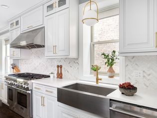
4 Easy Kitchen Upgrades That Instantly Make Your Home Look Good, According to Designers
Key Points Swap out cabinet hardware and light fixtures to instantly modernize your kitchen with min...
Concrete Paver Review: Pros and Cons
Concrete pavers are a very popular building material used to pave driveways, walkways, patios, and ...
We Asked Designers to Share Their Best Home Upgrades, and We Can't Wait to Try Them
This story is a part of our Old House New Issue, where we explore why people are no longer moving i...
Comments on "Designers Agree: This Earthy Shade Is Their Favorite Paint Color of All Time" :