We Asked Designers What Paint Colors Make a Kitchen Look Smaller—And We're Repainting ASAP
Key Takeaways
- Darker colors like charcoal or slate gray absorb light and can make a kitchen feel more confined.
- Rich jewel tones, like emerald or ruby red, similarly can make the walls appear closer together.
- Lighter versions of these hues, like greige or sage green, can offer a similar mood while opening up the space.
Kitchen colors can be a playground to explore color, from sage green cabinets to tuxedo palettes. However, it’s not just about aesthetics, especially if you’re short on space. In fact, there are certain colors that can make your kitchen look smaller than you might like.
To avoid any costly and laborious mistakes (and save you another trip to the paint store), we tapped designers for their take on what colors you should avoid using in the kitchen so that it doesn’t feel cramped. Plus, they offer alternative hues you can use instead, so that you can still invite your desired mood into the heart of the home.
Meet the Expert
- Amy Wax is an international color specialist for residential projects.
- Eddie Maestri is the principal and creative director of Maestri Studio.
Navy Blue
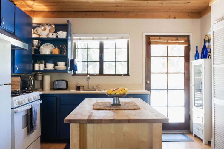
Tony Anderson / Getty Images
Darker colored walls—especially navy—can help add contrast to a kitchen if you like bright cabinetry, like blond wood, cream, or white painted cabinets.
"But the intensity of that contrast in such a small space can be overwhelming and honestly, distracting for such a small room," says Amy Wax, international color specialist.
Navy blue in particular is quite popular since it complements so many colors and is universally accepted. But if the hue feels like it might be too much for your small kitchen, Wax suggests trying a lighter slate blue or blue-gray.
"It's using an ever-popular blue with a softer touch," she says. "It minimizes the contrast while incorporating a color in the same family for your design."
Want more design inspiration? Sign up for our free daily newsletter for the latest decor ideas, designer tips, and more!
Charcoal Gray
imaginima / Getty Images
Charcoal gray stands out as a bold color choice in the neutral family, but it absorbs light since it is a darker hue. Thus, your kitchen can end up feeling confined rather than striking, whether you use it all over your kitchen or even just on the cabinets. Looking for an alternative option?
"Lighter neutrals will expand your kitchen, and there are countless options to choose from," Wax says. "From beiges to light grays to tans, taupe, rich caramels to cool grays, the world is your oyster if you're looking for neutral colors to expand the size of your kitchen."
Forest or Emerald Green
alvarez / Getty Images
Rich, dark greens are another bold choice that can add a sense of drama and refinement to a kitchen. Plus, many people enjoy them since they evoke elements of nature.
"But without natural light or breathing room, these deeper greens can weigh down a space," says interior designer Eddie Maestri.
This doesn't mean you have to shy away from green entirely, though. There are many options available from common paint brands that can evoke a similar feeling without making your kitchen feel stuffy.
"Consider a muted sage like Farrow & Ball Mizzle or Sherwin-Williams Sea Salt," Maestri suggests as a replacement. "These shades feel grounded and serene while keeping the space visually open."
Wax similarly recommends trying a softer sage or blue-green.
Dark Red
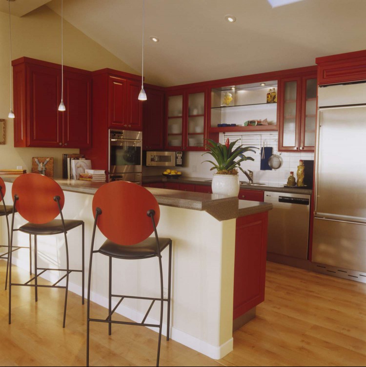
Scott Van Dyke / Getty Images
Like deep green, dark reds—like ruby, scarlet, or burgundy—can also have the negative effect of making your walls appear as if they are closer together. This results in the kitchen feeling dark and less spacious.
Wax finds that earthier reds like rust or terra cotta can create a lighter feel—while offering a more organic touch.
"Or you can add grace and charm by including a salmon pink or creamy white," she notes.
Deep Slate
FOTOGRAFIA INC. / Getty Images
Deep slate is a common choice for tuxedo-style kitchens and cabinets. Despite its popularity, though, it's not a one-size-fits-all solution.
"These inky tones are elegant but can absorb a lot of light, making tight spaces feel more enclosed," Maestri says.
If you still can't let go of gray or black, you can always opt for a lighter version—or blended version—of the color.
"A soft, warm greige like Benjamin Moore Revere Pewter adds depth without darkening the room," Maestri offers as an example. "It pairs beautifully with both warm and cool tones for flexibility."
RECOMMENDED NEWS
7 Ways to Open a Paint Can Like a Professional—and Not Spill a Drop
Painting is a DIY-friendly task, but if you’re a beginner, you might be stumped over how to even op...
How to Calculate How Much Paint You Need
When embarking on a paint project, the last thing you want is to spend too much or too little on th...
Apron Sink vs. Farmhouse Sink: Everything You Need to Know
If you’ve ever shopped for a kitchen sink and considered the farmhouse aesthetic, you’ve probably s...
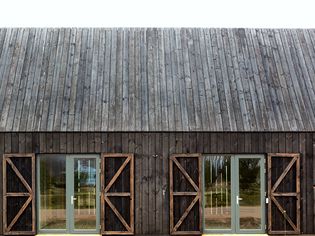
What Is Shou Sugi Ban (Yakisugi)?
Key Points Shou Sugi Ban is a traditional Japanese wood-preservation technique involving charring.Th...
I Thought Adhesive Strips Were Renter-Friendly—Then I Learned This Grown-Up Trick
I've technically been a renter my entire life, but the idea of "renter-friendly" wasn't introduced ...
Polyester or Microfiber—Which Is Better for Bed Sheets?
Polyester and microfiber are both comfortable fabrics used for bed sheets. Still, there are a few k...
Comments on "We Asked Designers What Paint Colors Make a Kitchen Look Smaller—And We're Repainting ASAP" :